Designing a Training Platform
Overview
Brief Design the MVP of a new training platform which allows members to access educational material
Duration 10 weeks
Team members 2x Product Designers, 1x User Researcher, Development Team, 1x Business Analyst, 1x Product Manager
My Involvement Sketching, wireframing, high fidelity design, user research planning, gallery walkthroughs
Result The MVP solved the two key usability issues of poor findability and discoverability of content, got positive feedback from 93% of users, and resulted in only 5% of users asking to be reverted to the legacy site which was significantly better than the target of 25%.
Background
The Association of International Certified Professional Accountants (AICPA) is the world’s largest membership organisation for accountants with over 400,000 members worldwide.
EY Seren was brought in as part of a larger digital transformation across the organisation to help accelerate AICPA’s growth. Another designer and I were tasked with designing the MVP of a new website which would allow their members to experience AICPA’s content and keep up-to-date with professional training.

The Problem
The previous discovery phase of work had uncovered two pain points with the current website which were prioritised for the MVP:
Discoverability — Users had trouble uncovering information that was relevant to them whilst browsing the site (even though relevant information existed)
Findability — Users had trouble finding specific information which they knew was on the site, including content they’d paid for
Solving these two pain points would be a tangible improvement in the experience and would hopefully be compelling enough to convince people to use the MVP.
Measuring Success
To determine if we’d been successful we’d measure the usual metrics for content consumption, including page views, % of returning visitors, and average time on page. Our key metric though would be the percentage of users who tried our new site that chose to be reverted to the legacy site. If a significant number of users would prefer to use the legacy website with its usability issues, then we’d know that our design had failed to enhance the experience.
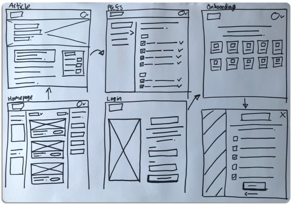
Sketching and Wireframing
Since we had the research, draft information architecture, and a rough MVP scope as outputs from the previous phase of work, I was able to begin sketching and then wireframe the initial experience without needing to carry out further discovery research.
User Testing
Working with our US-based user researcher, we conducted several rounds of testing with AICPA members. We did this to validate that our designs were progressing in the right direction and to check that the features we’d decided to prioritise for MVP delivered enough value to users to convince them to use it.
To plan and structure the insights and content of user testing sessions, we used a delta matrix. This is a tool used to record the answers to five questions after a round of testing:
What do we no longer believe?
What critical new information/insights did we learn?
Which questions do we want answered in our next testing cycle?
Which solution ideas do we want to try next?
What strengthened our hypotheses?
Focusing on answering these questions ensured we had a clear direction coming out of each round of testing and the information was quickly turned into actionable insights.

Design Highlight—Personalisation
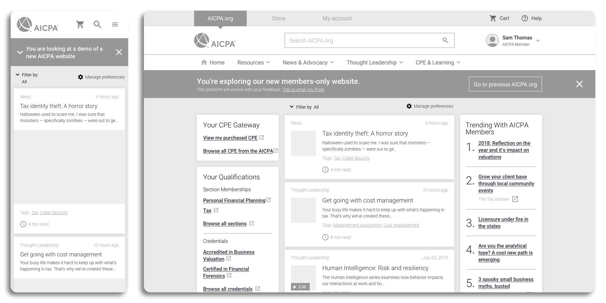
Poor discoverability — users not coming across relevant content as they browsed — was the first of the two key pain points we needed to solve for with the MVP. In our research we found that relevant, engaging content for users was on the site, they just didn’t know it existed. Because of this, we spent a lot of time focusing on creating a personalised experience for each user to bring relevant content to their attention. Working with the developers and business analysts, we implemented a recommendation engine which would surface relevant content to users in a newsfeed on their homepage.
We needed a way to persuade users to declare their interests. We settled on two options:
Prompt users to set their preferences on the homepage after onboarding, or
Present the preference screens to all users during onboarding
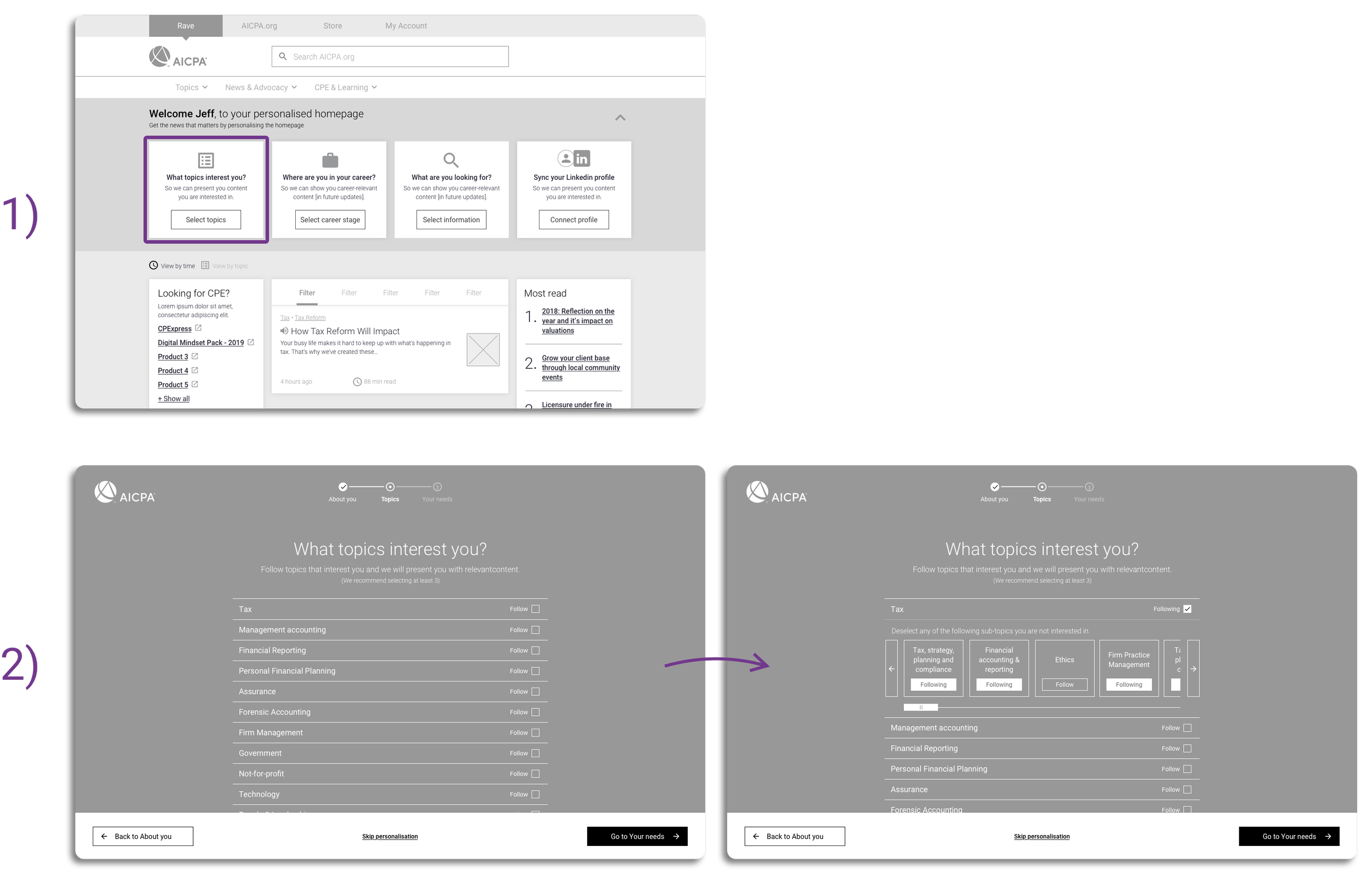
Through testing, we discovered that users found having a personalised newsfeed valuable enough to justify interrupting the onboarding journey by asking users to set their preferences. This would also mean that the newsfeed was populated with relevant content straightaway.
The final design balanced speed of completion with encouraging users to set their preferences thoroughly. To do this we removed all other steps from the onboarding and used interaction patterns, including overlays and expanding lists, to make the process feel as frictionless as possible.

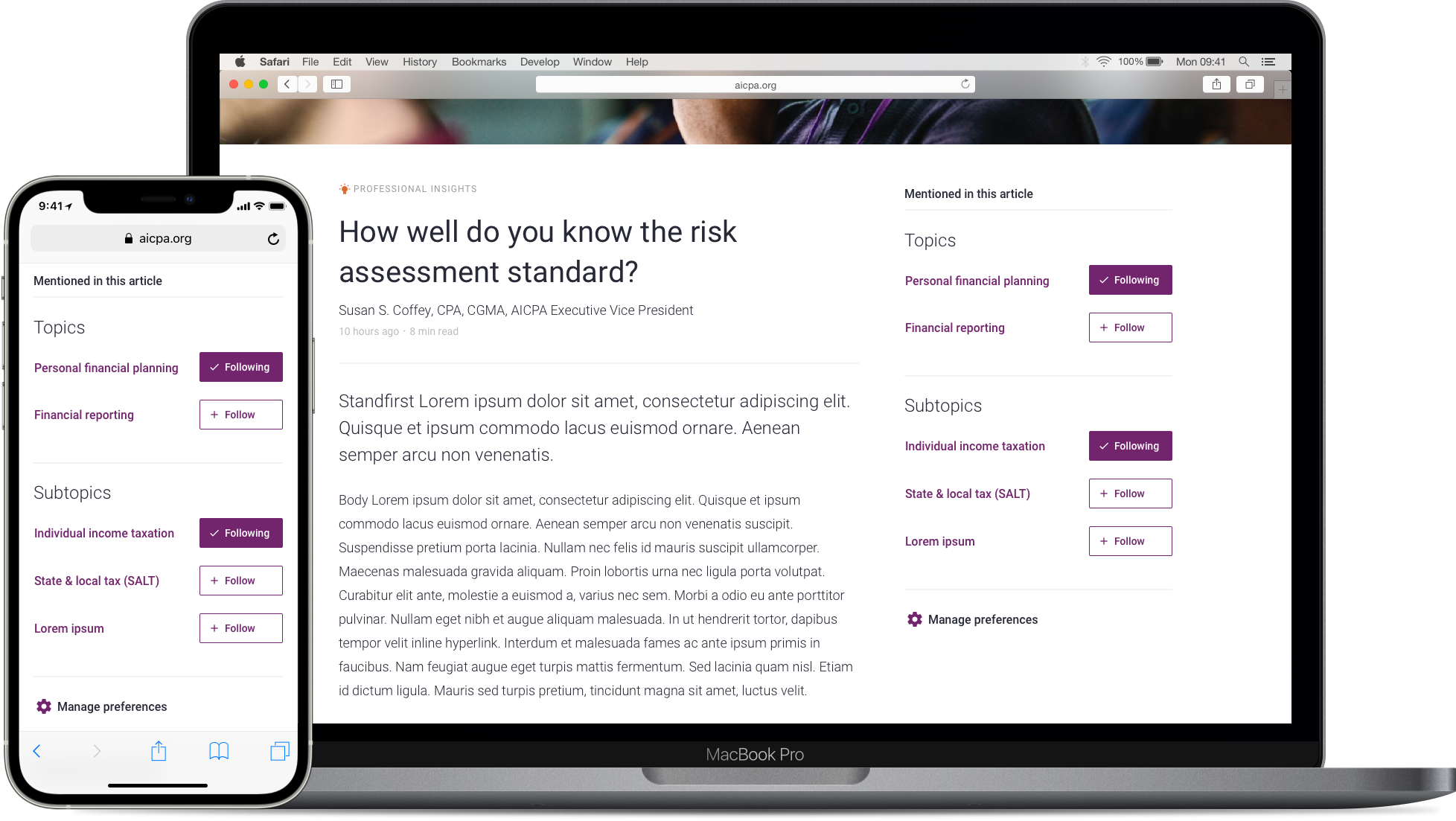
To help keep the personalised newsfeed content relevant over time, we allowed the user to follow topics and manage preferences whilst browsing articles.
Design Highlight—Search
Poor findability — users not being able to find content they know is on the site — was the second key pain point for the MVP to solve. One of the ways we aimed to solve this was by completely redesigning the search feature as we knew from analytics and interviews that this was one of the primary ways that users tried to find content on the legacy site.
Working with the development team, we:
Introduced predictive and recent searches to speed up the search process
Enhanced the filters to give users more control over the results
Changed the algorithm that ordered the results list to make results more relevant
Improved the UI presentation to make the experience more focused

After testing the search with a coded prototype, we discovered that one of the major user needs was to access content and reference material that they had already read. This led us to introduce a ‘saved items’ functionality to enable quick retrieval of information.

Gallery Walkthroughs
After each round of testing we had a gallery walkthrough where we printed out and displayed the designs we’d been testing and the user insights we’d gained and walked our stakeholders and developers through it. Having a collaborative feedback session like this allowed us to instantly debate and answer questions live and allowed different team members to leave their feedback in-context on the designs with sticky notes.
Showing the outputs from testing gave stakeholders visibility of what we were working on and helped them understand the rationale for our changes. It also allowed us to capture any questions ahead of the next round of testing. We repeated this process numerous times as the designs progressed which ensured that there was consensus on direction and technical feasibility when we arrived at the final design.


Results
At the end of the three months we delivered the last screens of the high fidelity designs to the developers ready for build. Anecdotally, through our user testing we’d found that the new website was easier to use than the legacy website. This improvement was shown clearly once the MVP went live to over 1,000 users and only 5% who were migrated onto the new website asked to be reverted back to the legacy site. This was significantly lower than the 25% target we’d been set and when combined with the overwhelmingly positive survey feedback shows that our designs provided real value for our users.
The comments collected from a feedback survey sent out a month after the MVP went live were overwhelmingly positive with only 7% of responses classified as ‘negative’. Overall our decision to launch a MVP quickly whilst also focusing on getting regular input from our users was vindicated with the positive feedback and established a strong foundation for the product.
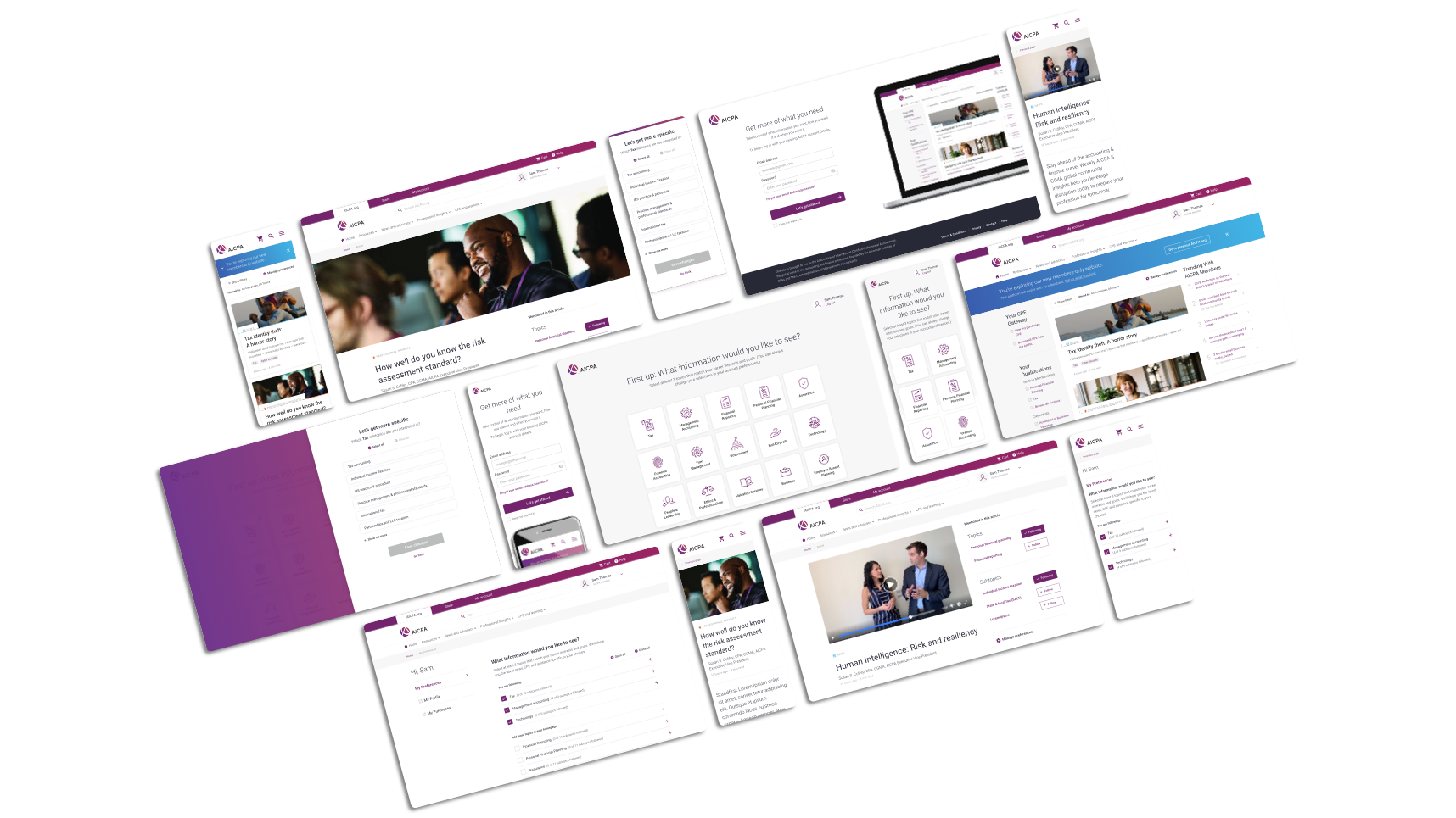
Final Screens


